Contacty
September 2024 - Ongoing
Overview
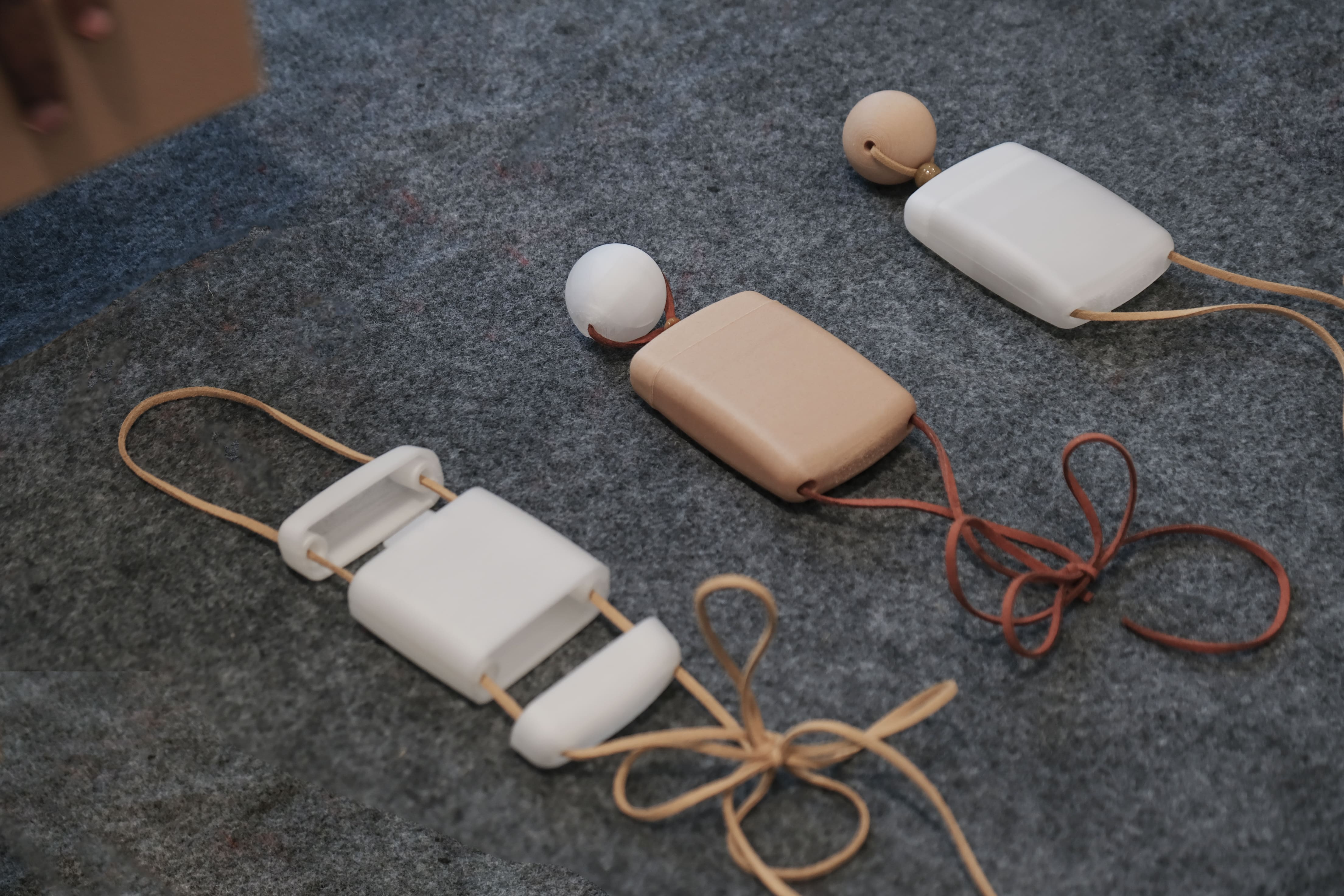
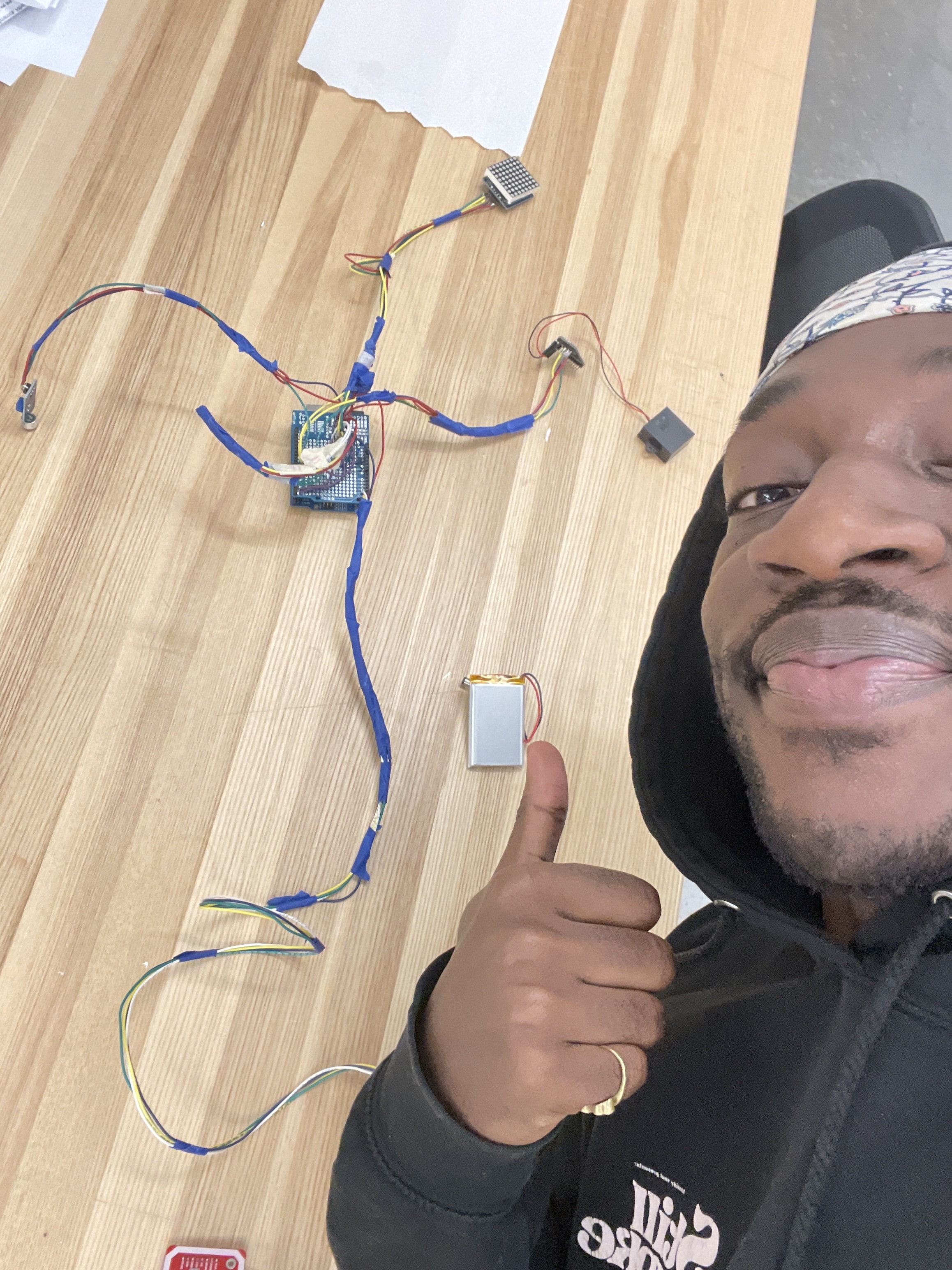
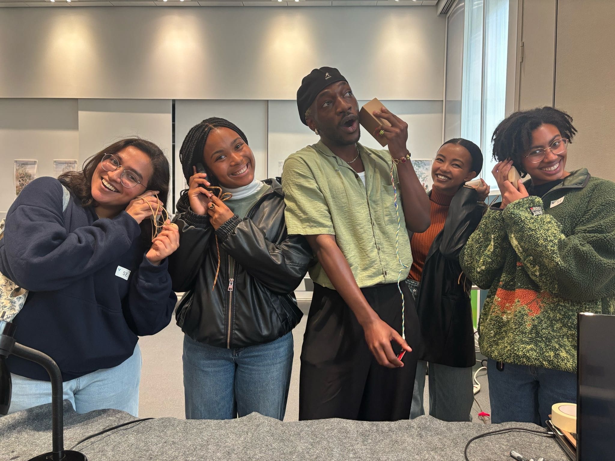
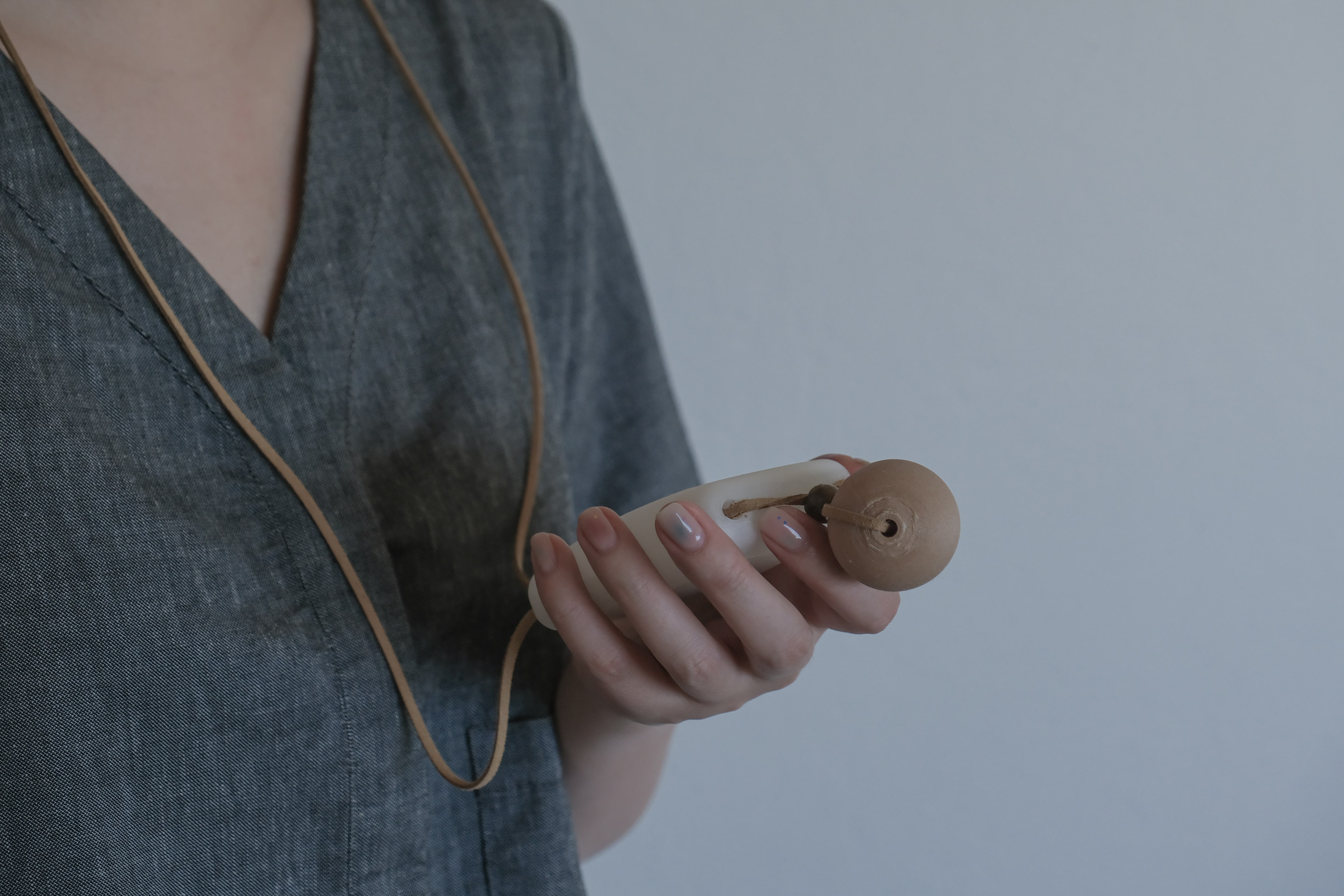
Designed and developed novel museum navigation device and software to promote community-led curation.
Role
UX Researcher & Physical Prototyper
Timeline
January 2025 - May 2025
Tools
Figma, Python, SQL, Arduino, AutoDesk Fusion, Prusa, Blender, Videographer
Teammates
Jiawen Chen - Architect ①
Omar Mohammad - Designer①
Nile Tan - Designer/Film maker ①
Client
The Asian Art Museum
The Problem
Museum curation is often divorced from community input, resulting in a museum experience that primarily reflects the intentions of the museum authorities. This often undercuts the benefits community members and museum visitors could experience by more community-informed modes of curation.
Results and Impact
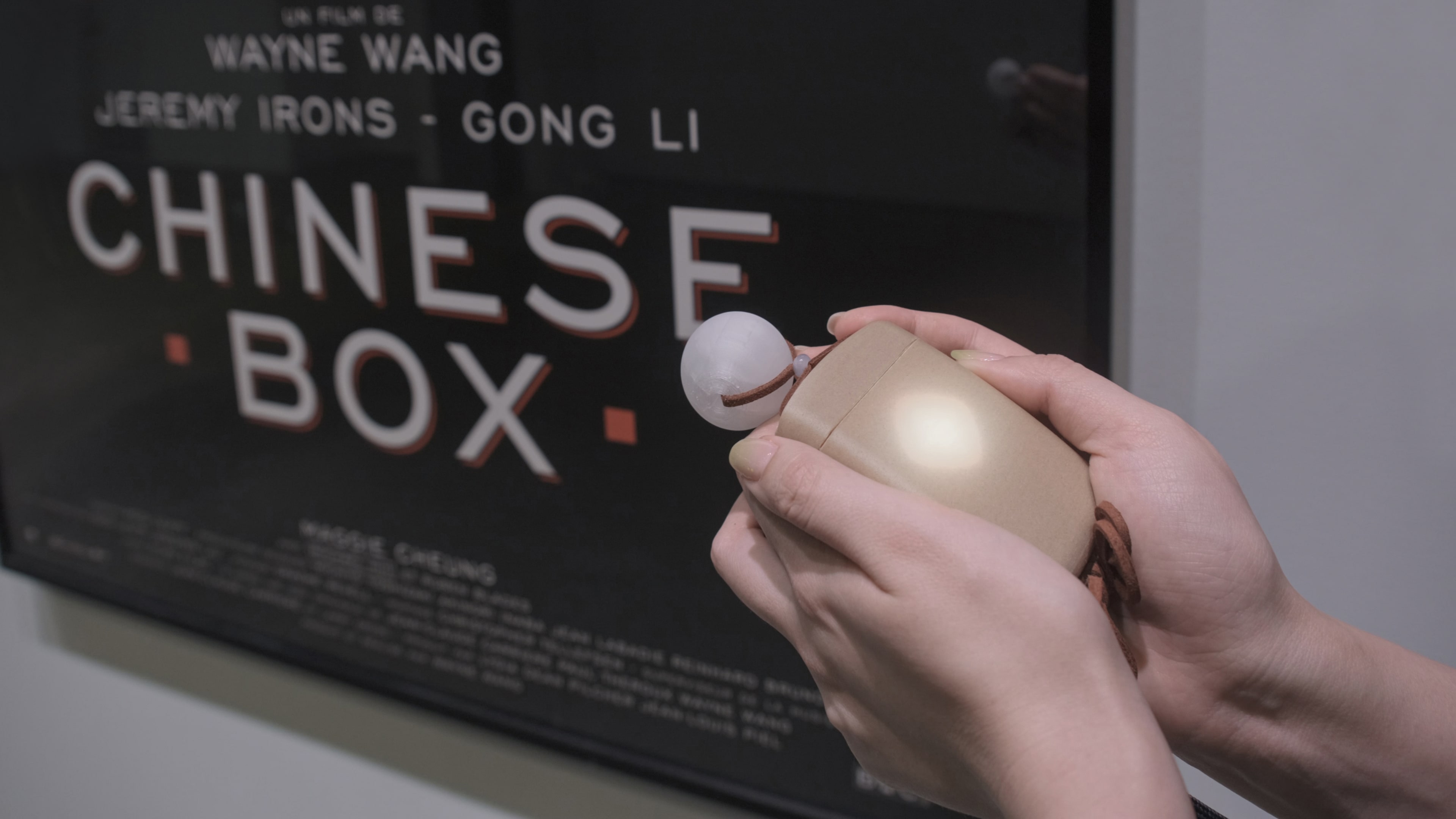
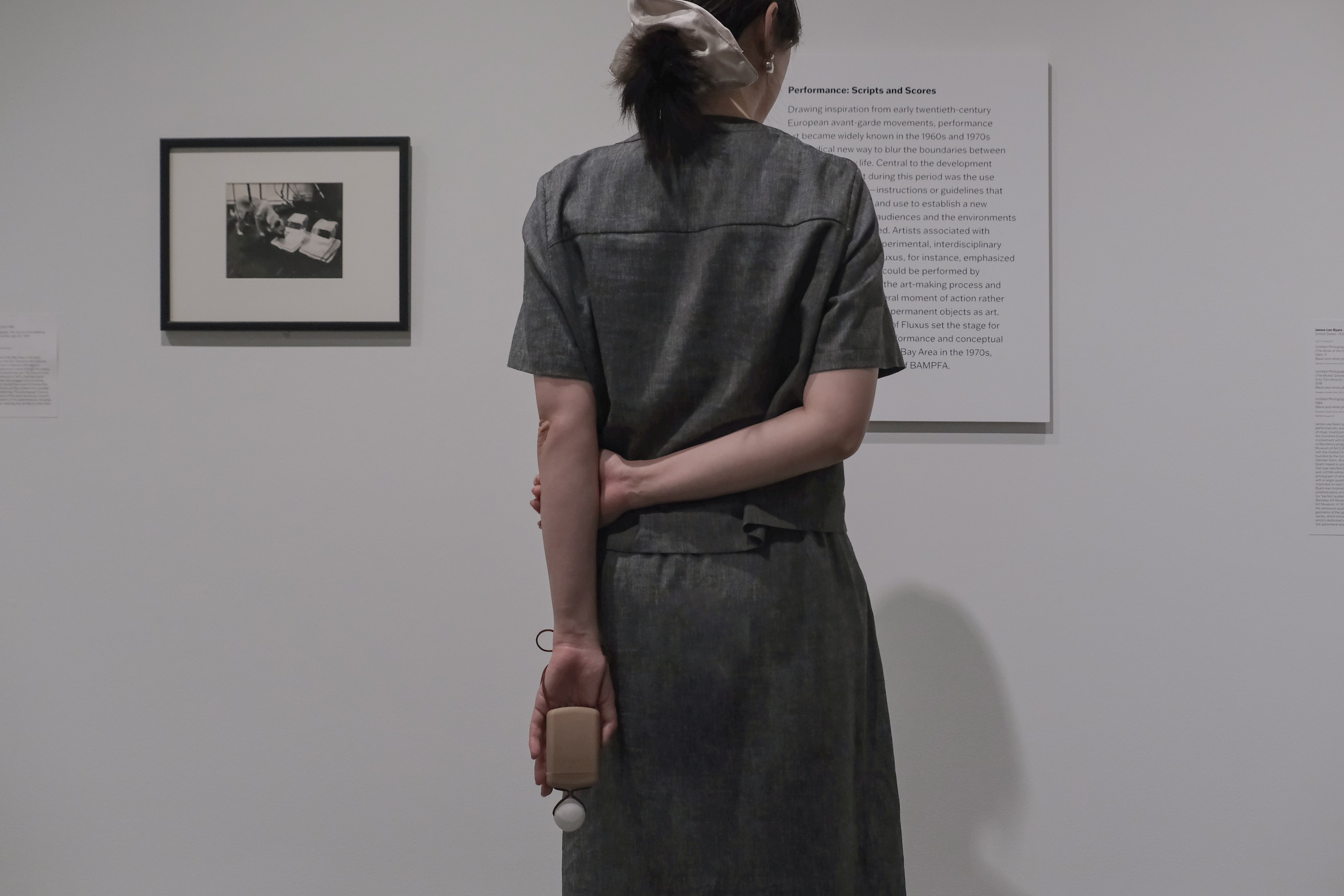
We designed and prototyped a museum navigation algorithm that is built on voice-based community-art interactions at the Asian Art Museum in San Francisco. The system includes a screenless device to foster inter-visitor engagement and deepen art understanding. It also opens up responsive and active models of museum-visitor interaction.
Problem Statement
How might we make curation more community-centered at the Asian Art Museum?
My Process
.png)
.png)

Results
We premiered this technology at the Asian Art Museum and have since been working on an expanded and adaptable version of the system that operates in augmented reality.Working on this project was a valuable exercise and learning experience in contextual design.
As a cultural institution, what we built needed to thematically match the environment, and achieving this required extensive cultural learning, active engagement with the Asian and Asian American community at the museum, and building directly on these insights.This project went on to receive an honorable mention at the 2025 San Francisco Design Week. To learn more about this work, please click the button below.
.png)
Overview
Designed foundational enterprise SaaS platform for validating complex environmental performance data.
Role
UI/UX Product Designer (Sole Designer)
Timeline
January 2026 - Ongoing
Tools
Figma, Google NotebookLM, Python, V0 by Vercel, ZeroWidth LLM, Postman, BeautifulSoup, Selenium
Teammates
Product Mangers ②
Front-end Enginner ①
The Problem
Environmental Product Declaration (EPD) data is essential for compliance and sustainability reporting, yet for this enterprise client, validation is often manual, fragmented, and hard to scale. Internal teams rely on disconnected tools and informal processes, making accuracy, consistency, and audit readiness difficult to maintain as operations grow.
Results and Impact
Replaced fragmented environmental data reviews with a structured, system-driven validation workflows, introducing clear stages, ownership, and feedback loops across facilities and materials. i centralized issues, flags, and approvals to improve EPD readiness, reduced ambiguity around review states, and established scalable design and interaction patterns intended to serve as the foundation for future enterprise sustainability and reporting products.
Problem Statement
How might we enable enterprise industrial teams to validate and operationalize environmental data with confidence, at scale?
Constraints
I worked with incomplete user access, high regulatory risk, the need to design a scalable system that could support multiple roles and future products and I needed to deliver a this as a confident and tested system within a very short timeframe.
Approach
I grounded my design decisions in direct user research(interviews and focus groups), desk research, competitive analysis, and established patterns from enterprise and project management software. Where I felt uncertain, I treated my decisions as assumptions, designing a system that could flex as those assumptions are tested and refined.
.png)
Key Design Decisions
• Validation reframed as structured work
• Progressive disclosure
• Designed for mixed expertise
• Collaboration anchored to decisions
• Learning-oriented system design
Design & Iteration
I used a system diagram to reason about how users move between states, how data and decisions flow across surfaces, and where handoffs or errors are most likely to occur. This helped me design for consistency, reuse, and scalability, rather than optimizing individual screens in isolation.
Key principles guiding the system design included:
- Reusable components and shared patterns to reduce cognitive load and speed up learning
- Consistent signaling for status, risk, progress, and ownership
- Clear state transitions between review, flagging, escalation, and completion
- Predictable interaction models across facilities, materials, and validation stages
- Shared primitives (cards, flags, progress indicators, notes) used across workflows
- Clear boundaries between manual review and automated checks in compliance contexts
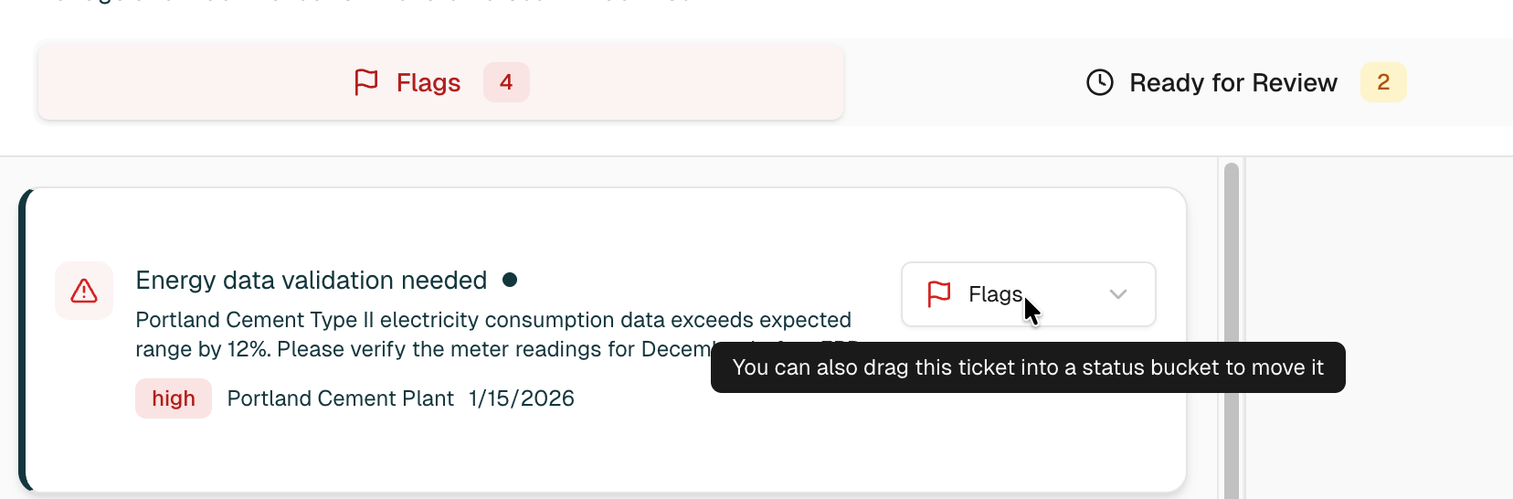
Validation reframed as structured work
This shows up through facility-scoped entry points, visible progress, and completion states that signal when work is done. These patterns borrow from task-completion models in project management tools to support momentum and orientation.
Validation reframed as structured work
Task progression nuance and iteration
Based on this, I changed the primary action to “Next” to reinforce task progression, and added a “Save and exit” option to support interruption without loss of work. I also introduced gating that prevents progression until all items in a stage are reviewed, reinforcing confidence and completeness.
The remaining open question is how to establish hierarchy and priority within individual validation cards. This is an area I plan to test further to determine whether visual emphasis, ordering, or risk indicators best guide attention without overwhelming users.
Validation reframed as structured work
Tradeoff: validation scoped to a facility context
This decision prioritizes accuracy and contextual safety over speed. By forcing users to explicitly choose a facility, the system reduces the risk of validating data in the wrong context. The tradeoff is that users who want to start with high-level analysis take an extra step, but analytical views remain accessible through previews, side panels, and dedicated visualization surfaces.
This reflects an intentional bias toward doing the right work in the right scope, rather than optimizing for the fastest possible entry into action.
Designing for mixed expertise: Progressive disclosure
This allows users to move quickly through validation without losing access to detail, avoiding separate “basic” and “advanced” modes.
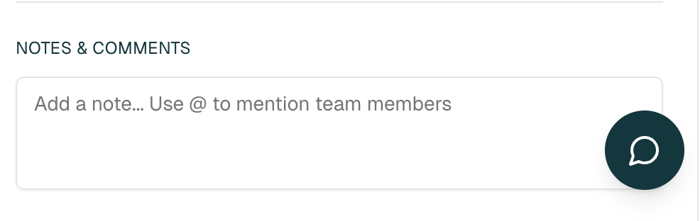
Collaboration anchored to decisions
This keeps context intact, improves traceability, and reduces reliance on external coordination tools. This also speaks to the designing for mixed expertise guides my design thinking. I plan to test whether this becomes the primary collaboration space or remains a secondary reference.
Learning-oriented system design
Additionally, in similar enterprise tools, I observed that users often plateau early and rely on only a small subset of features.
To counter this, I added contextual tooltips and lightweight guidance that appear during real work. These prompts surface more efficient workflows, explain why certain actions matter, and encourage users to gradually expand how they use the system.
I plan to test placement and frequency to ensure guidance drives discovery without becoming noise.
Results
Working with an enterprise client highlighted how much alignment, clarity, and restraint are required in complex environments. I often had to navigate differing priorities, push back on requests that added surface complexity without improving outcomes, and revise my own assumptions when feedback or testing showed they were off. Being the sole designer meant taking ownership of those decisions while staying open to correction.
I also collaborated closely with AI-assisted tools to rapidly prototype and explore interaction ideas, using them to pressure-test concepts and bring early flows to life. At the same time, this reinforced the importance of strong fundamentals. Clear wireframing, system thinking, and interaction design were essential before any high-fidelity or AI-generated prototypes could be useful.
There are still areas I would explore next, including deeper accessibility considerations, performance tradeoffs at scale, and more robust testing of hierarchy and prioritization within validation cards. These are intentional next steps rather than gaps, and they reflect where further user research and usage data would most meaningfully inform iteration.
Overall, this project reinforced the value of designing with humility, making assumptions explicit, and treating complex systems as something to be learned and refined over time rather than solved in one pass.
.png)
Overview
Reducing plastic bottle-use with UV-sanitized, accessible drinking fountains for Abu Dhabi’s Corniche.
Role
Lead Product Designer
Timeline
March 2021 - May 2021
Tools
Nomad Sculpt, Fusion 360, Rhino 3D, Adobe Illustrator, KeyShot
Teammates
Mechanical Engineers ②
Business Strategists ③
Product Manager ①
Architect ①
The Problem
Abu Dhabi’s Corniche hosts thousands of daily visitors like walkers, joggers, cyclists, and families. Yet, the absence of safe, inclusive drinking fountains forces reliance on bottled water, contributing to waste and excluding wheelchair users. Traditional fountains often go unused due to hygiene concerns and outdated design.
Results and Impact
Delivered to the UAE Ministry of Urban Planning, we designed a UV-sanitized, foot-pedal fountain for Abu Dhabi’s Corniche. Fully accessible and solar-powered, the design inspired plans to install public fountains along the Corniche, offering a scalable solution to eliminate 180,000 plastic bottles annually.
Research Question
Why are Abu Dhabi residents less inclined to use public outdoor drinking fountains?
Stakeholder & User Insights
Form & Functional Concept Development
System Engineering & Interaction Design
Accessibility Design
Final Design & Reflections


.png)
Stakeholder & User Insights
Form & Functional Concept Development
System Engineering & Interaction Design
Accessibility Design
Final Design & Reflections
1. Automated and safe hygiene system.
2. Wheelchair accessibility.
3. Contextually relevant form.

Stakeholder & User Insights
Form & Functional Concept Development
System Engineering & Interaction Design
Accessibility Design
Final Design & Reflections
1. HYGIENE


The water nozzle is positioned inside a semispherical enclosure that shields it from airborne contaminants, physical contact, and weather exposure. This reduces bacterial buildup during idle periods.
1.2. Automated UV-C disinfection cycle
UV-C LEDs (265nm wavelength) run continuously while the nozzle is enclosed, killing bacteria such as E. coli and coliform bacteria. The light shuts off automatically when the enclosure door opens, ensuring user safety, and restarts once the door closes.
1.3. Mechanical door and delayed water release
Water flow begins only after the door is fully open, reducing the risk of premature contamination. This sequencing ensures that users only interact with clean, sanitized surfaces.
1.4. Touchless interaction
A foot pedal replaces hand buttons to reduce skin-surface contact. The same pedal controls door opening and water flow, minimizing points of transmission and creating a faster and lighter system.
2. SUSTAINABILITY

The UV-C disinfection system is powered entirely by solar panels integrated into the fountain's structure. Positioned at an optimal angle for maximum sun exposure along the Corniche, this eliminates the need for external electricity or frequent battery changes, supporting off-grid, continuous operation.
2.2. Material selection for longevity
The body is constructed from reinforced concrete for weather resistance and durability, minimizing maintenance over time. Stainless steel is used for the nozzle enclosure to resist corrosion and enhance UV reflectivity, increasing sanitation efficiency. Aluminum foot pedals are lightweight yet durable, with anti-slip coating to ensure safety and reduce wear.
2.3. Low-maintenance mechanical design
The entire activation system is mechanically driven, no motors or sensors, making it easier to maintain and more reliable in outdoor public conditions. This reduces long-term resource use for repairs or replacements.
2.4. Water-conscious operation
Water only flows when the pedal is fully engaged, and stops immediately when released. This prevents excess water use and supports more conscious, controlled hydration.
2.5. Local environmental integration
The form and materials blend with the visual and climatic context of Abu Dhabi, reducing visual pollution and supporting the city’s goal of enhancing usable, sustainable public space.

Stakeholder & User Insights
Form & Functional Concept Development
System Engineering & Interaction Design
Accessibility Design
Final Design & Reflections
3. ACCESSIBILITY
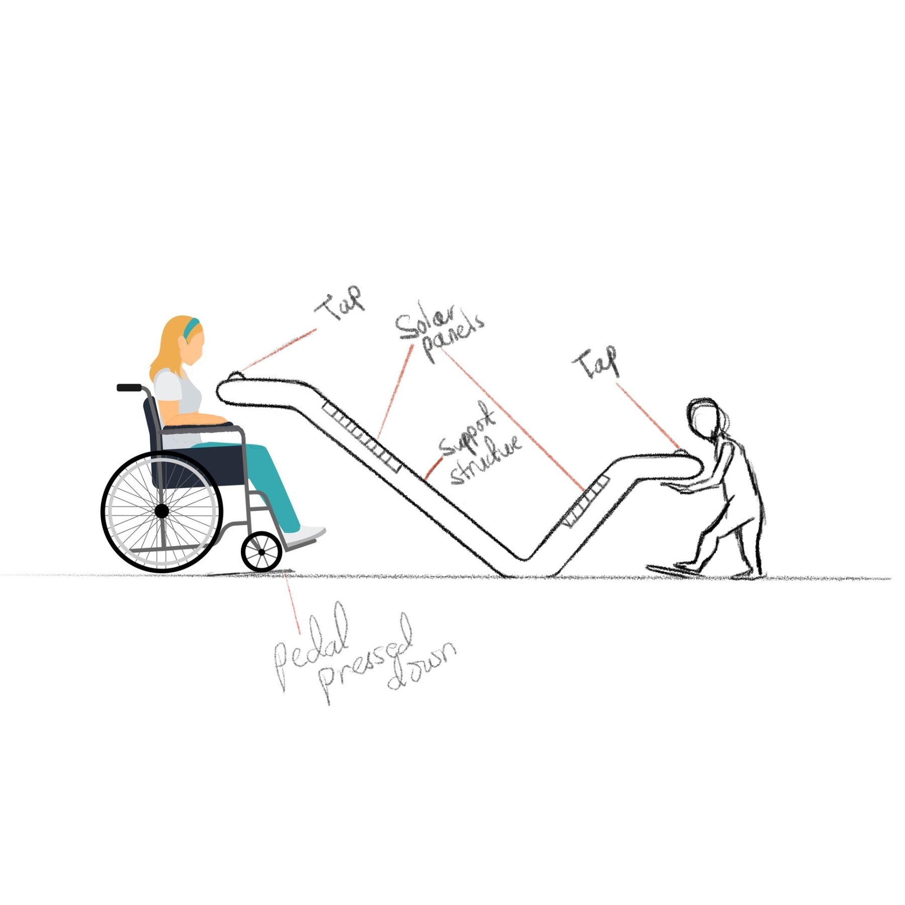
3.1. Dual-height sinks
The fountain includes two access points: one at 36 inches for standing and wheelchair users and another at 30 inches for children. Dimensions follow ADA compliance guidelines, adapted to regional standards.
3.2. Wheelchair-friendly pedal design
Pedals are placed within the required wheelchair approach zone (48 inches by 30 inches) and angled at 4.8 degrees to allow users to roll onto them easily. The required activation force is low enough for use with minimal mobility but resistant to accidental triggers.
3.3. Frontal clearance and approach
Each sink maintains at least 27 inches of knee clearance beneath, with rounded forms that allow easy frontal access. The open design avoids obstruction and encourages smooth alignment with mobility aids.
3.4. Anti-slip and tactile safety features
Pedals are coated with high-traction aluminum grip tape. All surfaces are smoothed and chamfered to reduce risk of injury or discomfort.
3.5. Intuitive interaction
The entire operation is managed by a single foot pedal. This removes cognitive barriers and simplifies use for a wide range of users, including children and the elderly.

FINAL DESIGN & REFLECTIONS
.png)

The final design is a fully self-sanitizing, hands-free public drinking fountain created specifically for Abu Dhabi’s Corniche, accessible, sustainable, and grounded in local visual language. With its dual-height sinks, foot-pedal activation, and solar-powered UV sanitation, it offers a safer, more inclusive alternative to bottled water in one of the city’s most visited public spaces.
The design was presented to the UAE Ministry of Urban Planning, where it contributed to early-stage efforts to reintroduce drinking fountains in Abu Dhabi. Our proposal helped shape conversations around sustainable urban hydration and influenced plans to bring more accessible water infrastructure to the Corniche.
I'm incredibly proud of what we achieved, not just as a functional product, but as a rethinking of how public design can serve health, sustainability, and equity all at once.
Massive thanks to Eunseo Bong, Samantha Lau, and Zak Saeed for being thoughtful, talented, and tireless collaborators throughout the process.

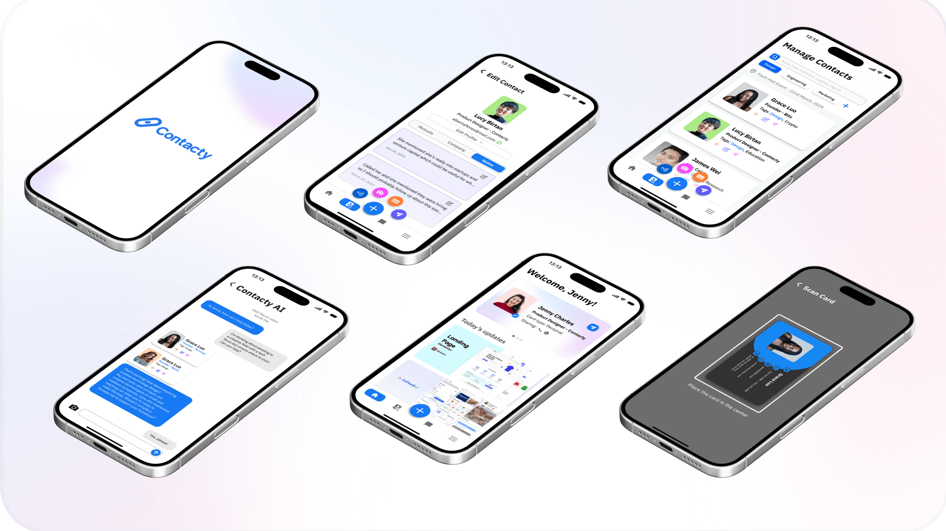
Overview
Designed an AI networking application that reduces contact management time by 70%, with 3x follow-up efficiency.
Role
Lead Product Designer
Timeline
Ongoing
Tools
Figma, Python, BeautifulSoup, Selenium, OpenAI API, ZeroWidth LLM, Lucidchart, Postman
Teammates
Software Engineers ②
AI/ML Engineers ②
Business Strategists ③
Product Manager ①
The Problem
Professionals often collect contacts at events, through LinkedIn, or referrals, but struggle to keep them organized, remember context, and follow up in a timely way. Existing tools store information but don’t support strategic, actionable networking.
Results and Impact
I designed and helped build an AI-powered tool that helps users collect, organize, and follow up with contacts more efficiently, turning scattered information into clear next steps creating a 70% reduction in manual effort and a 3x increase in follow-up effectiveness.
User Discovery
Understanding the User
Through in-person interviews, questionnaires with young and middle-aged professionals (who are our target user-group), and usability testing of current tools in the market we found that professionals struggle with:
• Disorganization
• Lost context
• Missed opportunities.
They need a tool that automates organization and provides strategic insights, not just a static contact list.
"I meet so many people at events, but I always forget to follow up in time!"
"I waste hours organizing contacts manually—I just need a smarter system."
"I add hundreds of LinkedIn connections, but I can’t remember who's most relevant later."
"Following up is so important, but it’s impossible to track who I should reach out to next!"
"Networking is valuable, but my contacts are scattered across emails, LinkedIn, and notes."
User Personas & Empathy Map


Research & Insights
Competitor analysis
I analyzed LinkedIn, internal phone contact organization, Instagram, HubSpot, Airtable, and Tiktok each offered parts of the solution but lacked context-aware follow-ups and AI-driven organization. This revealed a gap for a tool like Contacty, built specifically for personal, intelligent networking.
1. Lack of Centralized Systems
2. Inconsistent Data Entry & Poor Integration
3. No Intelligent Follow-Ups or Prioritization
4. Diverse Networking Contexts Aren’t Addressed
5. Absence of Standardized Data Handling
Opportunities Addressed
Contacty's Design Solutions
Design & Testing
core User Journey
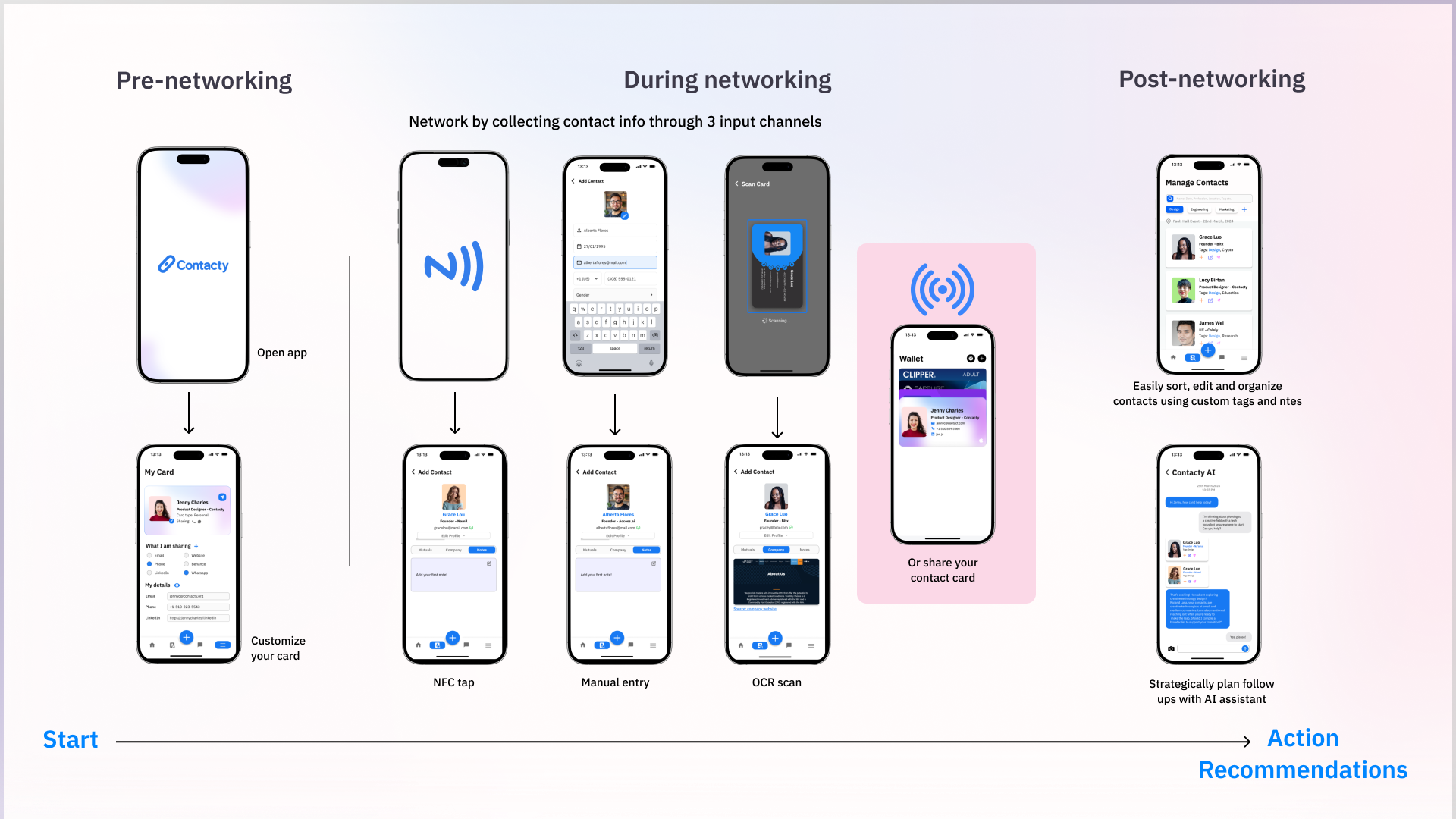
The user journey starts when a contact is captured through a scan, tap, or manual entry and Contacty immediately enriches the profile with relevant context. From there, the user can easily search, tag, and organize connections without any manual sorting. As career goals evolve, Contacty suggests who to follow up with and how, helping users move from collecting contacts to building meaningful, strategic relationships over time.
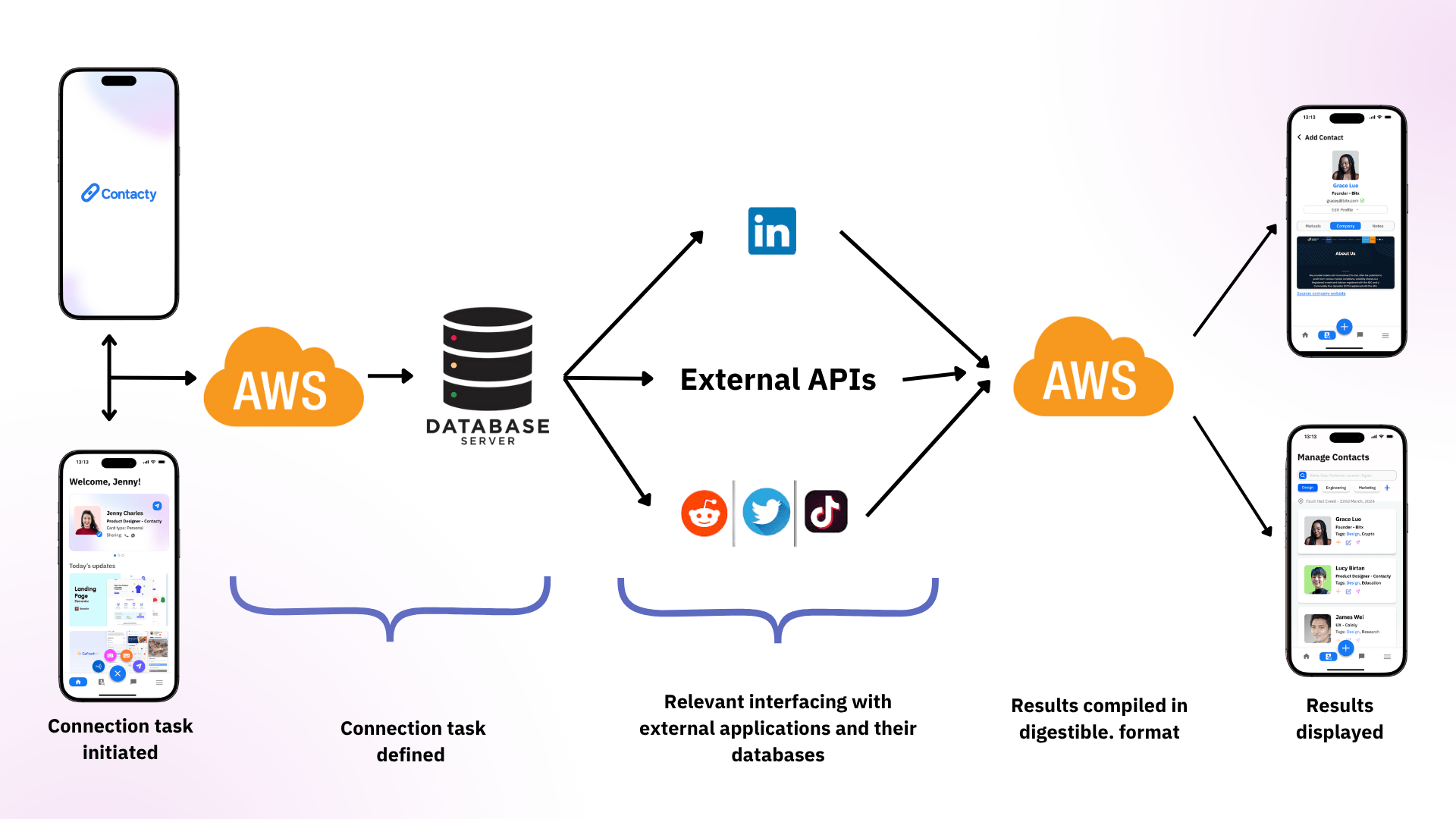
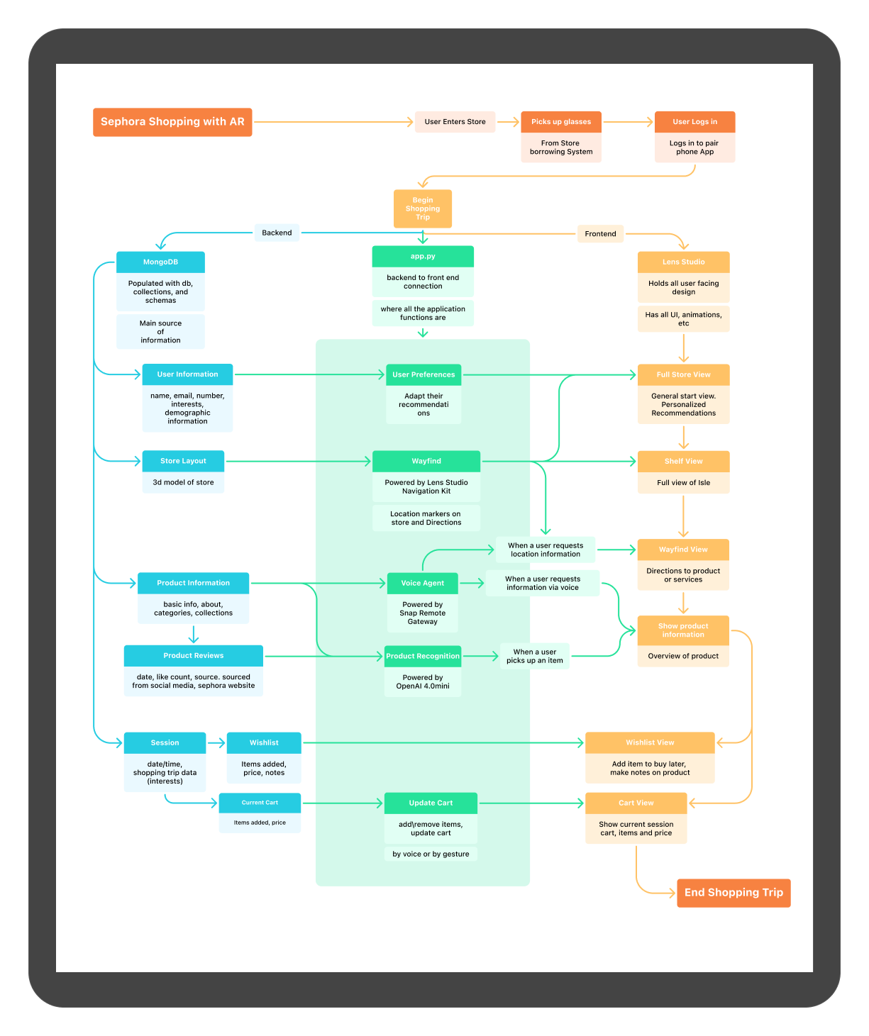
How Does The System Work?
The system begins when two users initiate a connection via any of the three modes available on the application. That request is sent to AWS, which relays the task to a central database server. The database interfaces with external APIs like LinkedIn, Twitter, and others to fetch relevant contact and contextual information. This enriched data is compiled and returned through AWS in a simplified, digestible format, which is then displayed on the user’s device for seamless, informed networking.
Interaction Design
I developed an interaction system grounded in progressive disclosure to guide users through tasks with clarity while maintaining a sense of responsiveness and delight. Through iterative testing, I established a consistent motion language using a fast-out, slow-in acceleration profile, staggered 60ms delays for secondary actions, and radial expansion anchored to the primary touchpoint. Motion was aligned with Fitts’s Law to support precision, and overshoot was removed to reduce visual noise. The result is an interaction pattern that feels smooth, controlled, and subtly playful, reinforcing both speed and confidence in use.

Testing the Technology
While developing the system, I focused on integrating AI with a custom social media scraping algorithm I developed to surface relevant connections. Using ZeroWidth, I tested how large language models could interpret user goals through prompt engineering, relevance scoring, and AI-generated messaging, creating a smarter, more personalized networking experience.
Mid-Fidelity Wireframes
I started with low-fidelity wireframes to lay out the core flows: capturing a contact, viewing enriched profiles, and receiving AI-driven follow-up suggestions. I focused on minimizing user effort, ensuring that adding a contact took no more than three taps and that smart recommendations felt accessible, not intrusive. These early wireframes helped test navigation logic, screen hierarchy, and how users might search or filter contacts before moving into more detailed visual and interaction design.

Iteration Journey
My interaction and design iteration journey was guided primarily by user testing, where I observed users complete tasks. By observing moments of hesitation, confusion, and delay, I was able to map out where users instinctively look for certain features and what the primary actions they completed on the app were. With this information, I was able to re-orient hierarchy in ways that favored organization over instant contact collection, resulting in a layout that prioritizes organization and strategization tasks.
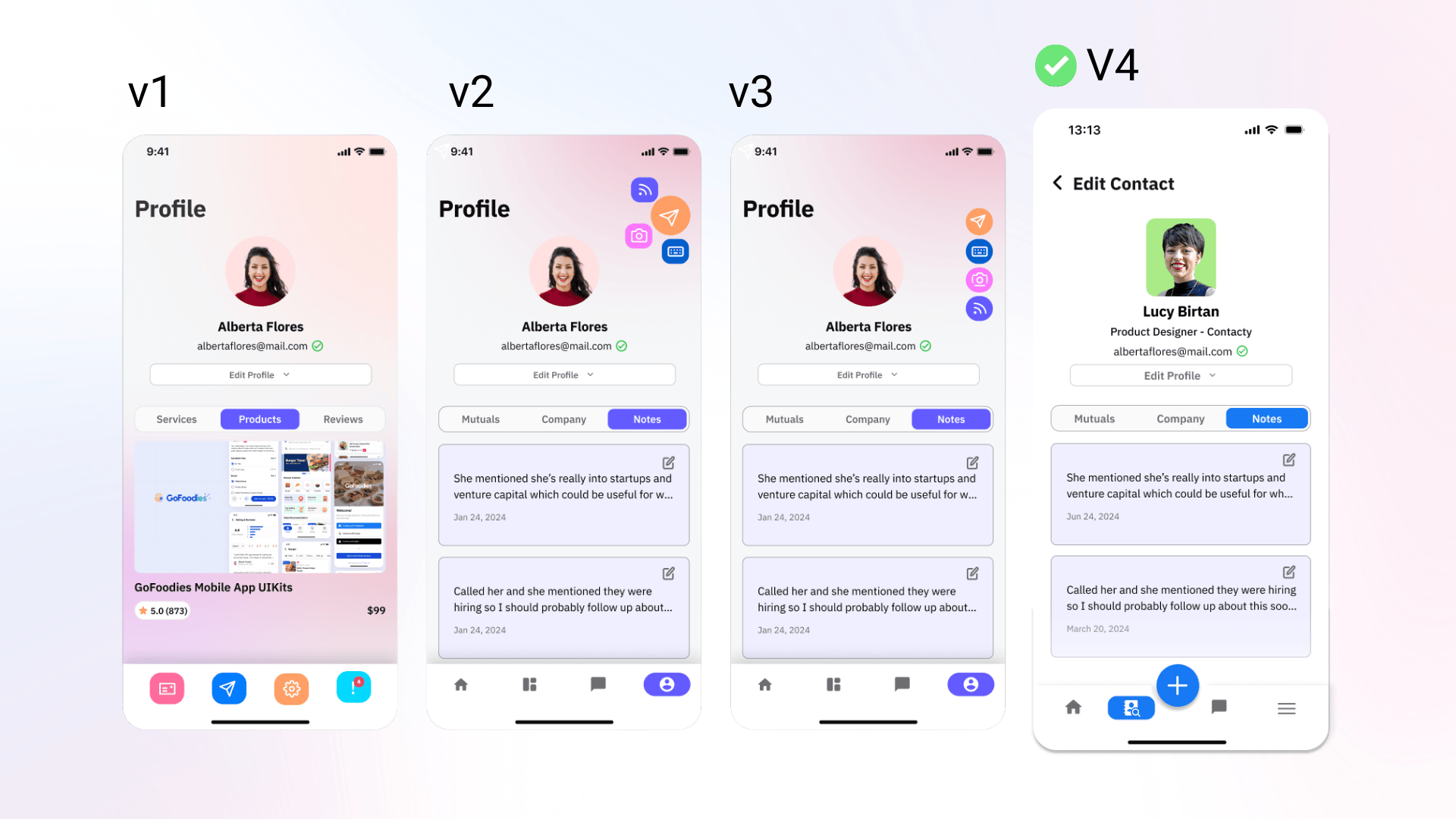
High-Fidelity wireframes
I designed the home screen to be quick and action-focused. Instead of showing everything at once, I prioritized the most important actions and let the rest unfold as needed, so users can move fast without feeling overwhelmed.
Multiple input methods - NFC, OCR, and manual entry - are unified into a single flow to reduce decision friction at the moment of networking. The system adapts to context, allowing users to choose the fastest capture method without breaking interaction continuity.
Identity sharing is designed to integrate with existing behaviors rather than replace them. By extending Apple Wallet, users can access and share customized information through a familiar interface, reducing learning curves while increasing flexibility.
I embedded the AI assistant within the interaction flow to support action, not interrupt it. Recommendations are surfaced contextually, helping users move from information to follow-up without navigating away from their current task.
Contact management is designed as a flexible retrieval system rather than a fixed structure. The “infinite tag” model allows users to organize and rediscover contacts through multiple entry points, supporting both precise search and exploratory recall.
Motion is used to reinforce interaction clarity and system cohesion. Transitions follow consistent patterns, anchored to user actions, timed to guide attention, and free of excess motion, creating a smooth, responsive experience that feels both controlled and engaging.
Visual Architecture

Iterations & Insights
User Feedback
We ran usability tests using high-fidelity Figma prototypes with 186 users from our target audience. Each participant was asked to complete tasks such as capturing a new contact, searching for a past connection, and acting on an AI-generated follow-up suggestion. Key insights:
after UI refinement
through auto-tagging
management time overall
Reflections
Building Contacty has been one of the most rewarding challenges I’ve taken on. Designing a tool that turns something as messy and human as networking into a clear, strategic process forced me to balance technical feasibility with real-world needs. Working at the intersection of product design, AI, and systems thinking pushed me to grow quickly, and made every iteration feel meaningful.
*Contacty was formerly known as "Linky".


I’m incredibly grateful to have worked alongside an ambitious and thoughtful team. Thank you to Jasmine Meziou, Javier Araiza, Koka Gugunava, Carmen Rodríguez, Facundo Kim, Patrick Jun, and Daniela Guerra for your insight, late nights, and commitment to making Contacty real. Presenting our work at the UC Berkeley Haas School of Business as part of a startup incubator was a full-circle moment, it helped validate what we were building and reminded us of the impact this could have beyond the classroom.
As we continue developing Contacty, we’re focused on:
1. Expanding AI recommendations with broader datasets
2. Integrating with and calendar tools
3. Launching a public beta to gather deeper user feedback
Grateful for how far we’ve come, and excited about what’s ahead!
Overview
Designed a replicable model for low-tech migration for 300,000+ Tanzania–Burundi refugees with 92% success using geofencing.
Roles
Founder, Product Designer, System Architect, Field Research Lead
Timeline
August 2022 - December 2024
Tools
KoboToolbox, Garmin eTrex GPS, OpenStreetMap (OSM), QGIS, PostGIS, Twilio SMS API, RapidPro
Teammates
Community volunteers ③
Refugee informants ②
Humanitarian workers ②
Telecom SMS engineers ①
The Problem
Burundian refugees moving between Tanzania and Burundi often travel without maps, internet, or verified information, relying on word-of-mouth while navigating dangerous, unmarked routes. This reflects a broader global migration challenge: the absence of reliable, low-tech systems to communicate real-time safety along human migration paths.
Results and Impact
We built a geofencing-based SMS alert system for Burundian refugees moving between Tanzania and Burundi, achieving 92% delivery success on feature phones. It serves as a potential replicable model for low-tech, migration-focused communication systems globally.
Content Note
Defining the problem
User Research Summary
We conducted 48 interviews with Burundian refugees, 4 focus groups in Nyarugusu camp, and 12 additional interviews with humanitarian workers and volunteers, which helped us uncover communication barriers, route knowledge gaps, and the heavy reliance on word-of-mouth among those migrating across the Tanzania–Burundi corridor.
Key Findings:
1. Refugees lacked access to up-to-date, verified route information and navigated with significant uncertainty.
2. Word-of-mouth was the dominant method for route planning, leading to inconsistent and sometimes dangerous outcomes.
3. The absence of internet access and smartphones meant that most digital tools were inaccessible.
4. Delay in accessing aid and shelter during the journey sometimes for months, causing eruption of diseases and loss of life during their journey.
Defining the problem
Journey Map

Defining the problem
Problem statement
Understanding the System
Scoping a Solution
Opportunity Areas
Due to the widespread ownership of mobile phones, and their existing use during migration for communication and exchanging vital route information, it became clear that phones offered several relevant affordances. The following quotes from refugee interviewees further affirm this insight:
"This phone is my lifeline—it’s how I find out where my family is and if the border is open."
"Sometimes, we don’t have money to send a message. We have to wait for someone else to share news."
"If we could receive messages about safe places along the way, it would make such a difference."
Scoping a Solution
Ssystem Flow Diagram

Scoping a Solution
Location Data and Security
Location zones were created collaboratively using Garmin eTrex devices and verbal mapping from refugee and aid workers. Points were logged, validated, and geofenced using QGIS and PostGIS. To address privacy and security risks:
No personal tracking was used; phones are not individually monitored.
Zones are passive: messages are triggered when a phone enters a tower area, not by GPS.
All alert content was vetted with humanitarians to avoid misuse or inciting panic.
Building Collaboratively
Contextualizing Our framework

Building Collaboratively
Mapping
Refugees and volunteers contributed to mapping safe and danger zones by sharing local route knowledge and GPS waypoints, which I helped translate into structured geofence zones using QGIS.
Through interviews, paper maps, and in-field validation, we collaboratively identified high-risk and aid-rich locations. These became the foundation of our alert system and ensured our mapped zones reflected lived reality on the ground.


TESTING
.png)

Reflections & next steps
Currently, the project is undergoing cross-border regulatory review by Tanzanian and Burundian authorities. This phase has introduced a new layer of learning, how to ethically and legally manage inter-country data flows, telecom collaboration, and humanitarian system integration.
Once approved, we intend to revisit our framing for replication to include learnings from this process, specifically around regulatory compliance, sovereignty, and local control of technology-driven interventions.
Project Impact:
126,000+ Burundian refugees can benefit
50 alerts tested
92% delivered
30+ danger or support zones mapped
Pilot sparked policy conversations and NGO interest
Next Steps:
Secure telecom/government approval
Develop real-time location mapping and editing
Scale pilot geographically
Publish replication toolkit
Limitations & Ethics:
No personal data stored
Alerts depend on coverage
Risks mitigated via human verification
Clear opt-in
Read more about this project here:
Overview
Boosted AI engagement by 75%, introduced 300+ users to Google’s Chimera Painter at the Mozilla Festival.
Role
AI Education Facilitator– User Research & Engagement Lead
Timeline
March 2021 - November 2021
Tools
Figma, Chimera Painter, Photoshop, Google Slides, Miro
Teammates
ML Engineer (Google AI)
Festival Participants (300+)
Creative Technologists
Context & Opportunity

What I Did
Outcome
to Google AI team
NOTE
Image Gallery


Lessons & Reflections
It pushed me to design not just for clarity, but for curiosity, to invite users into experimentation rather than just guide them through functionality. Collaborating with Google AI and engaging 300+ users from around the world also reminded me how powerful design can be when it connects people across skill levels, languages, and tools, not by simplifying complexity, but by scaffolding exploration.
Most of all, I learned that designing for unfamiliar tools requires deep empathy, procedural creativity, and a readiness to adapt fast. This experience sharpened my ability to design systems that teach as they guide, and to center the user even when the system itself is unfamiliar, invisible, or unpredictable.
Overview
Designed and delivered a hands-free AR shopping experience for Sephora stores in collaboration with Snap Inc. to reduce product returns.
Role
UX & Interaction Designer
• Designed scan-to-add feature, store mapping, and gesture recognition
• Drove user interviews, in-store testing, and iteration
• Partnered on backend product database integration and gesture workflows
Timeline
August 2025 - March 2026
Tools
Figma, Snap Lens Studio, OpenAI APIs, Gemini Live (vision), MongoDB, Notion
Teammates
• Isabella Wang
• Alistar Xiao,
• Cody Qiushi Chen,
• Edna Ho
•Aarya Harkare
•Katherin Velazquez
(Software Engineers, UX Researchers, Product Managers)
Clients
Snap Inc.
Sephora
The Problem
Retail shoppers struggle to get quick, trustworthy product context while browsing shelves especially for items with subtle differences (e.g., fragrances, cosmetics). Phone-based tools interrupt the physical experience and require cognitive switching, and existing in-store signage is static and generic. Ultimately, purchase confidence is low and product returns at Sephora stores is high.
Results and Impact
We delivered a wearable AR shopping assistant built on Snapchat Spectacles for Berkeley, CA Sephora stores. Backed by over $30k from Snap Inc., the system brings product information, reviews, and comparisons directly to the shelf using vision, voice, and gestures, helping shoppers make decisions with confidence, without pulling out their phones.
Problem Statement
How might we support confident, in-the-moment purchase decisions in Sephora stores without disrupting the embodied, social, and exploratory nature of shopping using the Snapchat Spectacles?
Research and Grounding
Understanding the User
The project began by visiting Sephora retail stores in Berkeley, CA, observing shopper behavior, and speaking directly with people while they browsed. I focused on moments of hesitation, comparison, and uncertainty.
Key insights:
1. Shoppers often want confirmation rather than deep research.
2. Phones interrupt the browsing rhythm.
3. Wearable interactions must feel lightweight and optional.
These insights pushed the design away from dense overlays and toward glanceable, on‑demand interactions.
Journey Mapping
After identifying Sephora shopper needs and pain points, I worked with fellow experience designers to pinpoint where wearable AR could add value in the in-store journey. We evaluated the affordances of Snapchat Spectacles alongside lessons from AR retail and wayfinding systems such as Amazon Go and Standard Cognition. This phase also included returning to stores to introduce shoppers to the Spectacles and gather feedback on comfort, social perception, and when AR support felt helpful versus intrusive.
I identified that the Spectacles could be a useful intervention if the interaction principles were grounded in:
1. Keeping interactions hands‑free and glanceable.
2. Give users control over when information appears.
3. Design for imperfect conditions such as noise, lighting, and shelf clutter.
Client Alignment and Iterative Design
Proposed User Journey
With research insights in place, we moved into alignment and negotiation with Snapchat and Sephora to define what could realistically be built, tested, and deployed within platform and retail constraints. These conversations helped narrow the scope to interactions that were technically feasible, socially acceptable, and valuable to both the platform and the retail context. With the two clients, the developed the user journey is as seen below.
Visual Design
Our initial interface used bright, high-contrast visuals to draw attention and stand out against Sephora’s shelves. User testing quickly showed the opposite effect: the colors distracted from the products, clashed with the store environment, and made the AR feel disconnected from the in-store experience shoppers valued. Based on this feedback, I pivoted to a more minimal, transparent interface that supported presence rather than competing for attention.
%402x.png)
.png)
Visual Design
In the second iteration, the interface was redesigned to visually recede into the environment. Instead of asking users to focus on the AR layer, the overlay was treated as a subtle augmentation of the shelf itself. Text was minimized, color was used sparingly, and transparency allowed the physical product to remain the primary visual anchor. This shift aligned more closely with why users came into the store in the first place: to see, feel, and experience products in person, with AR acting as quiet support rather than the center of attention.
Visual Design - Lens Studio
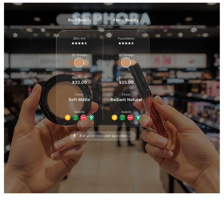
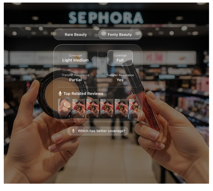
Lens Studio was still a new platform with limited documentation, so much of the work involved defining patterns as we built. I led the design and development of item recognition and checkout, grounding the flow in familiar scan-to-pay interactions. Through iteration and in-store testing, barcode scanning proved to be the most reliable AR checkout approach. In parallel, I designed a navigation system that surfaced only relevant labels based on eye line and head movement, using a cascading, dismissible layout that kept focus on the shelves rather than the interface.
.png)
Lens Studio development environment
.png)
Store AR mapping and labeling
.png)
.png)
Bar code scanning screens
Interaction Design
I designed gesture recognition based on how shoppers naturally move in Sephora, such as hovering while deciding, sliding products to compare, or stepping back to scan a shelf. These behaviors informed simple, low-effort gestures for revealing details, comparing items, and confirming actions. The gesture set was grounded in in-store observation and established research on embodied interaction and public gesture usability, and was iteratively tested in-store to ensure it felt intuitive and socially comfortable in crowded aisles.
.png)
Product-to-skin gesture for pigmented products to highlight pigment matching
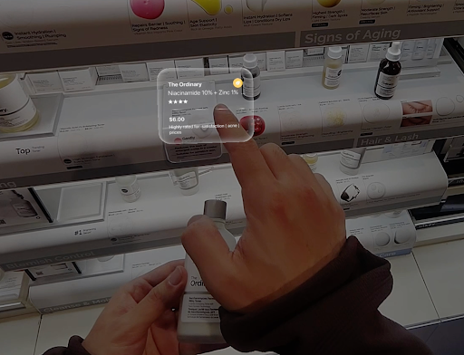
Point/skimming gesture to reveal product details mimicking reading behaviour
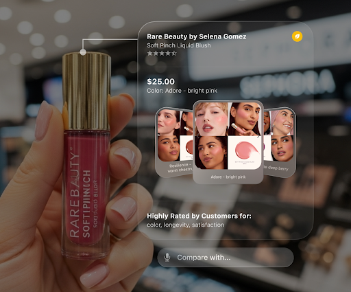
Long focus interaction to reveal associated products carousel
Testing the Technology
Testing was conducted through repeated in-store demos and short guided trials with shoppers using live Spectacles prototypes. We observed how quickly users understood each interaction, where they hesitated, and when they disengaged or reverted to their phones. Feedback from these sessions directly informed iteration cycles, including simplifying gesture sets, reducing on-screen text, adjusting overlay timing, and refining scan-to-add reliability under varied lighting and shelf conditions. Each iteration was validated back in the store, ensuring changes improved confidence and flow in real shopping environments rather than controlled lab settings.
Reflections & Insights
This project highlighted how much care is required to introduce new technology into everyday, shared spaces. The strongest outcomes came from designing with restraint, allowing AR to support existing shopping behaviors rather than compete with them.
I’m deeply grateful to my teammates on this project for their collaboration across research, design, and engineering, and to our partners at Snapchat and Sephora for their trust, support, and openness to experimentation. We are continuing to iterate on the experience through ongoing user testing, with a focus on improving spatial reliability, refining interaction comfort, and validating longer-term impact on shopping confidence and behavior.
My amazing team!
Let's Connect!

